Have you ever wondered about the meaning behind the symbols used in product logos? The Quang Thuy Chopsticks logo is not only a simple symbol, but it is also a profound message about the quality and natural origin of the product. With a sophisticated combination of colors, images and fonts, this logo conveys a story of perfection and commitment from the brand.
In this article, let’s explore with Quang Thuy Chopsticks the meaning of the Quang Thuy Chopsticks logo and learn in detail about the elements used in the logo to convey the message about the quality and natural origin of the product. Let’s explore together the beauty and meaning behind the small details in this symbol, and learn about our desire: to contribute to creating a meaningful experience for customers.
The Quang Thuy Chopsticks logo is not simply a symbol, but it also contains a profound message about the quality and natural origin of the product. By analyzing the elements in the logo, we can better understand the meaning it brings:
Colors and Meanings:
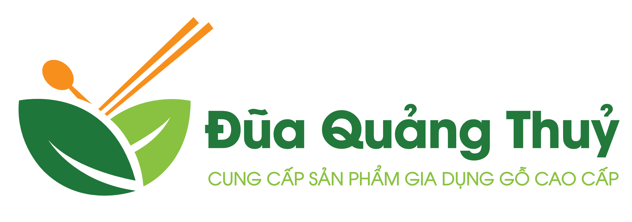
The colors in the Quang Thuy Chopsticks logo are not just random combinations, but they are also carefully chosen to convey certain meanings. Green, representing nature and the freshness of plants, combined with orange, represents the beauty and vitality of natural wood. The blend of these two colors not only creates harmony but also affirms that the quality of the product comes from natural, safe and sustainable raw materials for consumers.
Image in Logo:
The image in the Quang Thuy Chopsticks logo also plays an important role in conveying the message about quality and natural origin. The bottom part of the logo is designed with the image of two tree leaves put together, creating an enveloping and protective feeling like a bowl of rice, bringing a feeling of safety and coziness to the user. Above is an image of chopsticks and a spoon, arranged in a check mark shape, symbolizing maximum quality with a score of 10. This is a clear expression of our commitment to quality and perfection in each product. Quang Thuy chopsticks.
Font and Style:
The rounded AVO font was carefully selected not only to enhance the aesthetics of the logo but also to convey to customers a feeling of closeness and sincerity from the brand. The round style of this font is like a family dinner tray, creating a close and friendly space, helping consumers feel easy to approach and trust in Quang Thuy Chopsticks products.
Tóm lại
On the journey to discover the meaning of the Quang Thuy Chopsticks logo, we have seen a profound story about the commitment to quality and natural origin of the product. From the blend of colors to the symbolic images, every detail in this logo brings a meaningful message and connection to customers.
The Quang Thuy Chopsticks logo is not only a symbol of a brand, but also a testament to its commitment to quality and respect for natural ingredients. By conveying these values, the brand builds a trusting and lasting relationship with customers, contributing to a community of love and support.
To experience the perfection and intimacy that the Quang Thuy Chopsticks logo brings, learn more about this product and brand. Be sure that each product you choose will come from a natural source and ensure safety for you and your family.
Thank you for taking the time to accompany us in discovering the meaning and value of Quang Thuy Chopsticks. See you again on your next exploration journeys!


Leave a Reply